Emile Menhem: the interdisciplinary designer as a public practitioner
Lara Balaa
27.08.2026
Emile Menhem (b. 1951) is a Lebanese-born painter, writer, art critic, and graphic designer, despite not introducing himself as any of the above. For Menhem, these practices are means of social engagement; he practices as a way of engaging culturally and politically with his community. In a recent lecture he delivered to graphic design students at the Lebanese American University (LAU) in 2024,1 Menhem stressed that design is a product of society, meaning that a designer’s worldview and imagination are shaped by their social environment, and that their production is part of a cycle of communication that can only be completed upon reception. This belief is central to understanding Menhem’s design trajectory.
In this essay, I focus on Emile Menhem’s work as an editorial designer, drawing on the book covers featured in Decolonizing the Page (see Room 1: ‘From Cover to Cover’). I briefly discuss his upbringing to provide context for his motivation to pursue design, at a time when graphic design had not yet emerged as a distinct academic discipline in Lebanon. I then discuss the book covers in question, highlighting the particularities of Menhem’s approach, which eventually led him to specialize in newspaper design. I conclude with a reflection on the lessons that contemporary design students, practitioners, and educators could learn from his experience.
Menhem’s upbringing: The seeds of a socially engaged public practice
Menhem grew up as an avid reader and was introduced to the world of artistic production and publishing early on. He was born in the village of Ijdabra, in the Batroun district of North Lebanon. As a child, he spent a lot of time with his uncle, Tanios Menhem (1914–1984), nicknamed ‘the Red Priest’ for his support of Latin American Liberation Theology. Tanios Menhem was also a journalist, educator, linguist, and writer. He was surrounded by politically engaged artists and intellectuals, and Menhem grew up in that environment. On Saturdays, the child sometimes accompanied his uncle to visit his close friend, the Muslim cleric and linguist Shaykh Abdullah al-Alayli (1914–1996), whose office was in al-Azarieh, in the Beirut central district. The building, at the time, was a cultural hub that housed publishers like Dar al-Adab, Dar al-Qawmia lil-Tawzi’, and Dar al Ma’aref. The latter published children’s books by the Egyptian author Kamel Kilani (1897–1959), which the uncle would purchase for the young boy, who would thoroughly enjoy reading through them and admiring their illustrations.2
With that upbringing, it is no surprise that Menhem would be drawn to visual and literary arts. When it was time to go to university, he decided to double-major in fine arts and Arabic literature. As an arts student, Menhem had serious concerns about the fate of artworks. He felt uneasy that an artwork could be privately owned and destroyed by its owner, rather than being preserved and made available as a public asset. In the lecture I referenced earlier, Menhem shared his experience engaging with a communist ideology that opposed the private ownership of artworks, while navigating the realities of his world as a student: his father had passed away, and he needed money to buy a coat for his younger sister. He recalls being approached about the acquisition of two of his paintings by an art buyer seeking to purchase students’ artworks to decorate the palace of a Saudi king. This proposition left Menhem in a dilemma, forcing him to choose between his political convictions and his emotional commitments and practical needs. He opted for the latter. Menhem shared this anecdote with students as an example of how an artist cannot be isolated from their surroundings and must engage in constant dialogue with the social conditions that shape their reality.
With the outbreak of the civil war in Lebanon, and the closure of the Lebanese University during the academic year 1975–76, Menhem joined the production team of the periodical Falastin al-Thawra (Palestine the Revolution). The periodical was published by the Unified Palestinian Press, which functioned as the media support unit for the Palestine Liberation Organization (PLO). In that capacity, as well as through friendships and personal connections, Menhem designed a wide range of printed materials, including serial publications, political posters, and book covers, while sharing a studio with artists Seta Manoukian and Samir Khaddaje.3
Besides the political urgency of the moment, the public nature of publishing and the democratic nature of books and other printed material—in contrast with the private nature of art collection—were among the factors that drew Menhem and other politically engaged artists of his generation to practice graphic design.4
Illustrating book covers: Violence and imagination
Menhem’s three book covers featured in this exhibition are part of a larger visual shift that Zeina Maasri observes, starting in the 1960s, in which Arabic book covers moved away from traditional calligraphy and typesetting toward incorporating modern artwork and illustration.5
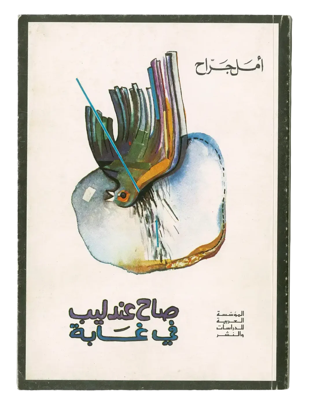

The first book cover is that of a poetry collection titled Sah Andalib fi Ghabah (A Nightingale Called out in a Forest) by the poet and novelist Amal Jarrah, published by the Arab Institute for Research and Publishing in 1978 (Fig. 1). Jarrah (1945–2004) was born to Syrian parents in the southern Lebanese village of Marjaayoun. Her lyrical prose poetry often speaks of love and loss, exacerbated by wars.6 This was the third of her published collections. Its title, A Nightingale Called out in a Forest, is a reminder of the epistemological question, ‘If a tree falls in the forest, and there is no one to hear it, does it make a sound?’ The title and its reference make the visualization on the cover ever more potent. The cover features a watercolour illustration of a colourful nightingale lying upside down on a rock, pierced by an arrow and bleeding to death. The nightingale is known for its beautiful, colourful, and complex song, and the reader is made to witness the silencing of its song, in reference to undocumented Israeli war crimes in Lebanon.
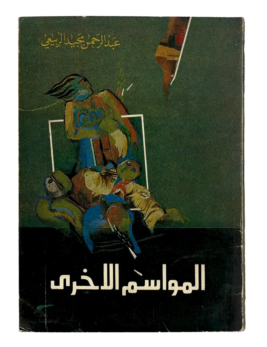
The second book cover is that of a short story collection titled Al-Mawasim al-Ukhrah (The Other Seasons) by the Iraqi fiction writer and novelist Abdul Rahman Majid al-Rubaie (1939–2023), published by Dar al-Tali’a in 1979 (Fig. 2). This is the second edition of a collection that includes thirteen short stories, initially published in 1970,7 a few years after the 1967 War, in which Arab states were defeated by the Israeli army. The cover illustration is an abstract oil pastel painting featuring a group of people in what appears to be a post-battle scene, gathered within a white frame, one of whom, likely a tired combatant, towers over the others, leaning on the upper part of the frame and looking toward an object in the distance, possibly a weapon that is pointed at him. The composition holds tension, created by the mirrored angles at which the framed composition intersects with the object in the distance.
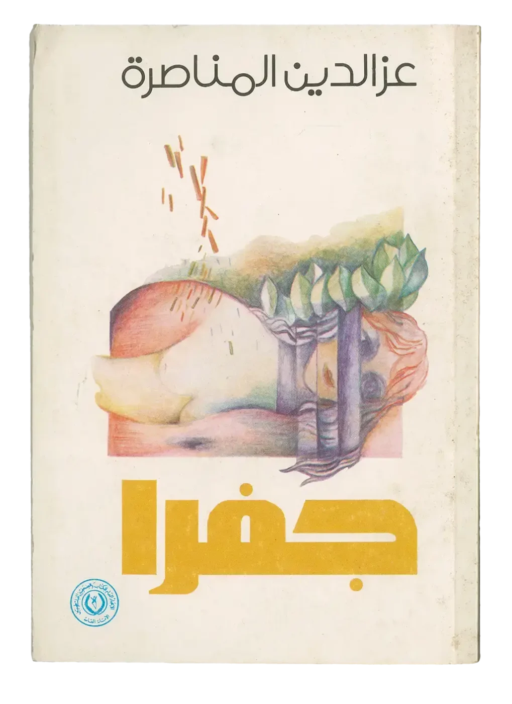
The third book cover featured in the exhibition is that of Jaffra by the Palestinian poet Izzaddin al-Munasirah (1946–2021), published by the Union of Palestinian Writers and Journalists in 1981 (Fig. 3). Jaffra is al-Munasirah’s iconic poem, in which he borrows the figure of Jaffra, a lost love from Palestinian folklore, to tell his own story of losing his Palestinian lover, who was killed by fire from an Israeli aircraft during a raid on Beirut in 1976.8 The cover features a pencil colour illustration of a female figure lying on the ground, behind bars, looking directly at the reader, demanding that they bear witness to her martyrdom. The figure, Jaffra, a personification of Palestinian resistance, is under attack by bullets that are raining on her at an angle. Despite the illustration’s rectangular shape, which may well remind us of a coffin, the woman’s hair defies its confined borders, planting firm roots in the ground and nurturing the green leaves that form the fields behind her, promising continued life and the survival of resistance.
The language of symbolism and the theme of disruption are common to all three book covers. Whether presented in the form of bullets raining down, a piercing arrow, or a weapon at an angle, the violent disruption of life is the reality of an Arab world that was, and continues to be, shaped by consecutive wars and a lasting Israeli occupation. These book covers are clear examples of how this shared reality brought artists, such as Menhem, together with writers from different parts of the Arab world, through cross-border networks of publishing, artistic collaboration and anti-colonial solidarity.9
Drawing letters: From need to specialization
Together, these three covers not only attest to Menhem’s versatility as an artist-graphic designer10 who is comfortable working across media but also draw attention to his approach to composition and lettering. The affordances of photographic film and offset printing technologies allowed Menhem and his contemporaries to get past the limitations of classical calligraphy and the narrow selection of typefaces available on the market, and experiment with drawing their own letters.
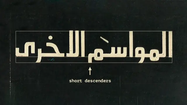
When Menhem began designing covers, the Naskhi calligraphic style,11 which can be seen in the authors’ names on the first two covers, was widely used by publishers. This calligraphic style originated in a scribal tradition intended for copying long texts. According to Menhem, Naskhi is characterized by high descenders, like the case of the letter kaf (كـ), and low descenders, like that of the letter ‘ain (ع), resulting in negative spaces that made it difficult for him to create a solid visual cluster from calligraphic elements such as an author’s name or a book title. On the other hand, the logic of design, as he described it, is built on visual clustering and composition. This led him to explore the geometric Kufi style as an alternative. This style was inherently solid because it was conceived for use on architectural surfaces. Menhem quickly realized that if he removed the floral ornaments that often adorned this geometric style, he could create word clusters that allow for solid compositions.12
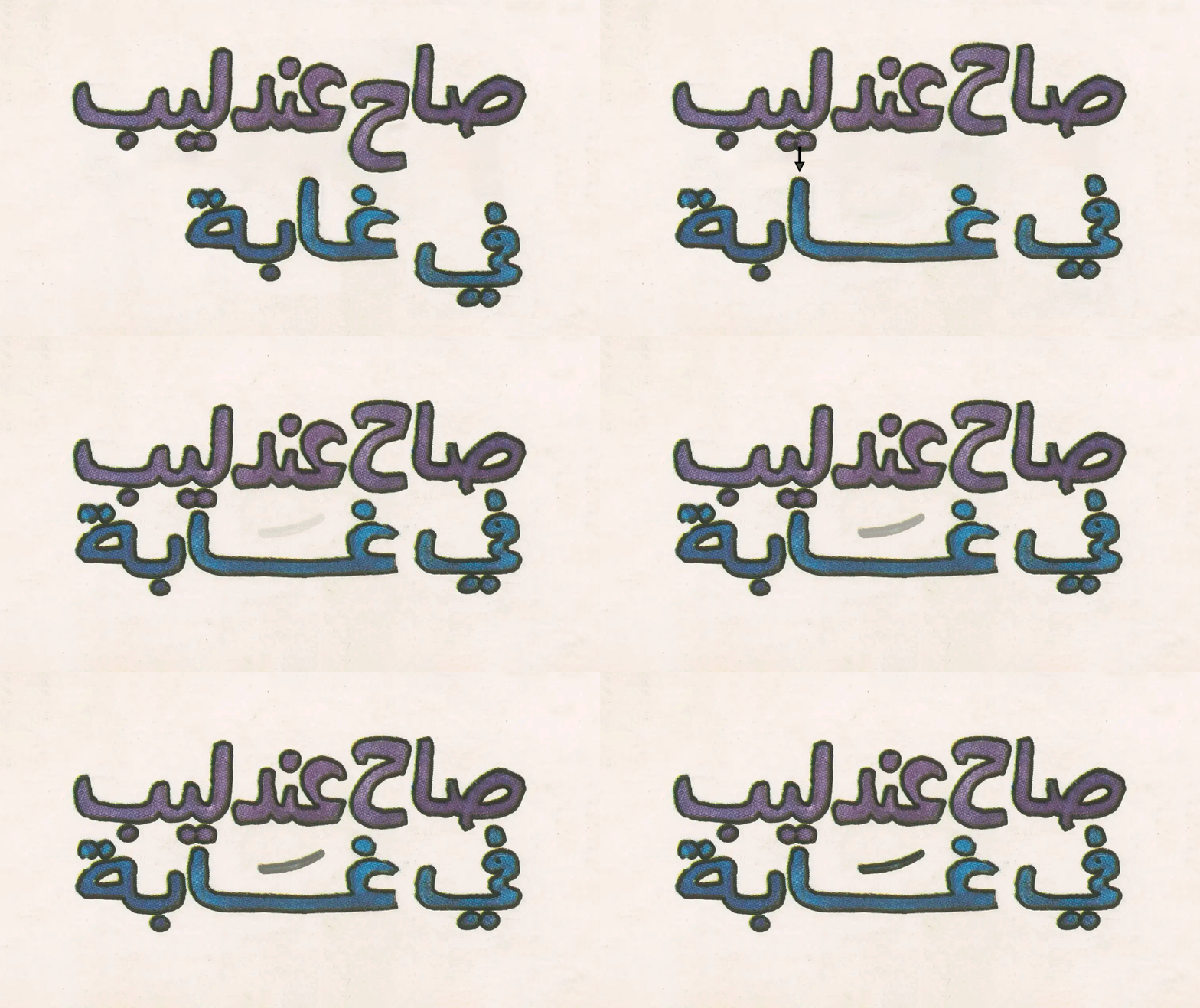
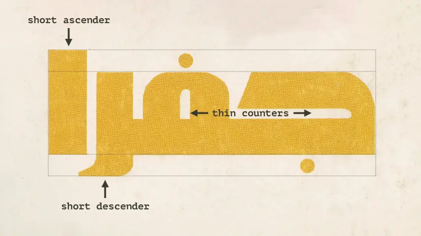
The titles on the three covers show different ways Menhem tried to address the challenge of creating a solid title block. In the hand-drawn lettering of Sah Andalib fi Ghabah, Menhem worked on minimizing the negative spaces in the title by moving the descenders, such as the letters ha (ح) and ya (ـي) up, to rest on the same baseline as the other letters. He also extended the space between the letters ghain (غـ) and alef (ـا) to create equilibrium between the two lines that make up the title, tightened the line spacing, and added a fatha (َ ) diacritic to balance the resulting negative space created by this extension (Fig. 4). The two other titles are constructed rather than hand-drawn. In both instances, Menhem shortened the descenders to enhance the continuity in the titles’ baselines. Jaffra’s title best illustrates Menhem’s approach to lettering: a single visual block of bold letterforms with thin counters, short descenders and ascenders, with the remaining negative spaces balanced by the small dots under the letter jim (جـ) and above the letter fa (ـفـ) (Figs 5 and 6).
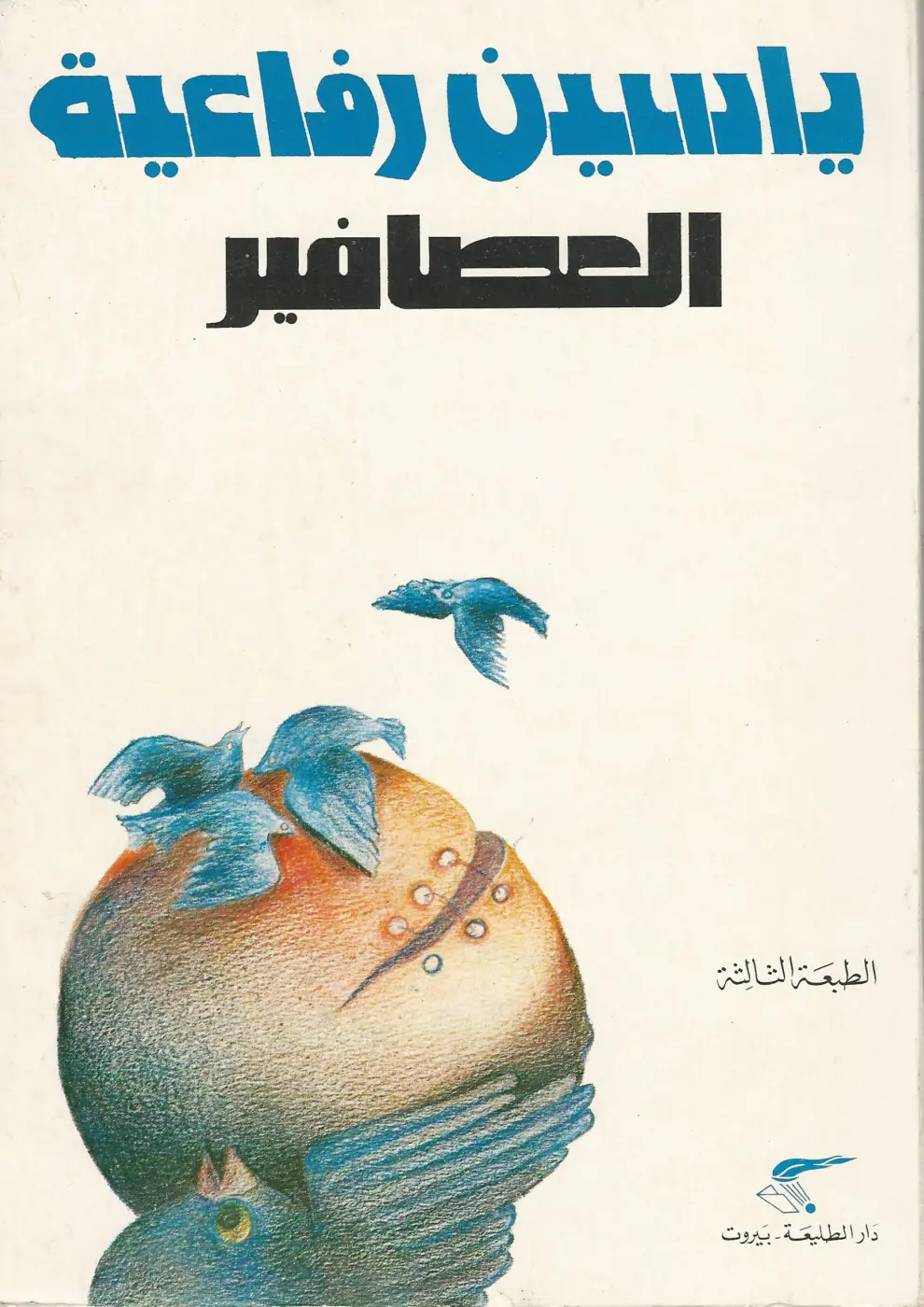
The accentuated prominence of the author’s name on Jaffra’s book cover is also worth noting. Menhem noticed that his own reading choices were more likely to be based on authors than book titles, which is why he pushed to highlight authors’ names on the book covers he designed.13 This inclination is perhaps most evident in the cover of the third edition of Yassin Rafaiyah’s short story collection Al-‘Assafir (The Birds), published by Dar al-Tali’a in 1979, in which the author’s name is larger than the book’s title (Fig. 7).
Designing letterforms began as a side practice meant to enhance Menhem’s compositions but quickly became an anchoring type-design activity. Today, Menhem is best known for designing the Lebanese newspaper al-Akhbar (2006) and the pan-Arab al-Araby al-Jadeed (2014). Both newspapers use custom-made Kufi style headlines and versatile layout templates for their different sections. These newspapers showcase Menhem’s well-rounded approach to design, which extends to editorial and art direction. They are innovative in their identity, format, layout and information structure, graphic compositions, and photographic choices that are progressive in both composition and content.14
The interdisciplinarity and social engagement of Menhem and his contemporaries
Menhem’s insistence that his design practice forms part of a broader project of political and social engagement deserves recognition and offers important lessons for contemporary design.
First, this recognition expands our understanding of the graphic design profession beyond commercialism and into the broader public sphere, re-igniting questions about the social responsibility of designers as cultural agents. Such questions are a necessary by-product of the global conditions created by colonialism and capitalism, with the first providing the resources for the second. While such conditions may have been felt differently in different parts of the world, questions about design and social responsibility were equally pressing for many designers of Menhem’s generation, across localities. In England, for example, Ken Garland published his iconic manifesto First Things First in 1964,15 in which he urged designers to employ their skills for the advancement of social good rather than advertising and consumption.
Second, and perhaps more importantly, this recognition pushes us to question the university’s segmentation of knowledge into educational disciplines that tend to graduate students whose knowledge is specialized and siloed, rather than interdisciplinary and well-rounded. Menhem and many of his contemporaries, whose work is represented in this collection, arrived at graphic design practice instead of being professionally trained in it. They were artists whose knowledge was interdisciplinary and whose approaches to design were experimental and personalized rather than following a predefined canon; their explorations not yet shaped by the US-centric educational programs that would begin to form in Lebanon from the 1990s onwards. One of the most urgent questions this collection asks is: What can we learn from a generation of designers who practiced graphic design in the Arab world before graphic design was institutionalized as a contained and defined knowledge domain?
Lara Balaa is an editorial designer, lecturer, and writer specializing in Arabic print and design culture. She authored the monograph Emile Menhem: Invigorating Arab Journalism Through Graphic Design (Khatt Books, 2019) and co-founded Maajoun Design Studio in Beirut (2010–2018). She is an Adjunct Assistant Professor at the Lebanese American University in Beirut and a PhD Candidate at Rutgers University in New Jersey, where she researches calligraphic knowledge in contemporary Lebanese design culture.
Acknowledgments:
I am deeply grateful to Emile Menhem and Zeina Maasri. Both have been, and continue to be, great teachers to me.
- Emile Menhem, lecture on art and social engagement (guest lecture, GRDE 431: Graphic Design in the Middle East, taught by Yasmine Nachabe Taan, Lebanese American University, Beirut, Lebanon, March 13, 2024). ↩︎
- For more on Emile Menhem’s biography and design work, see Lara Balaa, Emile Menhem: Invigorating Arab Journalism Through Graphic Design, Arabic Design Library vol. 6 (Amsterdam: Khatt Books, 2019). ↩︎
- For more on Menhem’s work from this period, see Balaa, Emile Menhem, chaps. 1 and 2, about his collaboration with Seta Manoukian and Samir Khaddaje, see Gregory Buchakjian, ‘How do children witness war? Seta Manoukian’s Lebanese children and the war’ in Decolonizing the Page, July 8, 2026 and Zeina Maasri, Off the Wall: Political Posters of the Lebanese Civil War (London: I.B. Tauris, 2009), 44. ↩︎
- See Zeina Maasri, ‘Activism and the history of graphic design: the 1960s generation of Arab artist-designers’, Decolonizing the Page, June 29, 2026. ↩︎
- Zeina Maasri, ‘Book Arts as Archives of Decolonization: The Design and Visuality of Arabic Books (1950s–1980s)’, Journal of Design History 39, no. 1 (2026): 70–88. ↩︎
- Omar Alshaikh, ‘Mukhtarat Amal Jarrah al-Shiriyyah: Simfuniyyat al-Shahqah al-Aṭifiyyah’, Review of Amal Jarrah: Mukhtarat Shiriyyah, by Amal Jarrah, Sahifat Tishreen, March 3, 2009. ↩︎
- As-Safir. ‘“Al-Mawasim al-Ukhra” li Abdul Rahman al-Rubaie: Monolog ‘ala lawḥah tashkiliyyah’, April 4, 1979. ↩︎
- Juhayna Mohamed Al-Sharif, ‘Qissat Hubb Filastiniyyah: (Jaffra al-Shahidah, 1976, wa Jaffra al-Turath, 1939)’, Wattan, September 12, 2018, accessed July 15, 2026. ↩︎
- See Maasri, ‘Book Arts as Archives of Decolonization’. ↩︎
- This hyphenated form refers to academically trained artists who integrated graphic design into their artistic practice, see Maasri, ‘Book Arts as Archives of Decolonization’. ↩︎
- For more on the history and evolution of this style, see, for example, J. R. Osborn, Letters of Light: Arabic Script in Calligraphy, Print, and Digital Design. Cambridge, MA: Harvard University Press, 2017. ↩︎
- Menhem, lecture on art and social engagement. ↩︎
- See Balaa, Emile Menhem, 57. ↩︎
- For more on Menhem’s journalistic design work, see Balaa, Emile Menhem, chap. 3. ↩︎
- ‘The First Things First Manifesto’, Design is History, www.designishistory.com/1960/first-things-first ↩︎